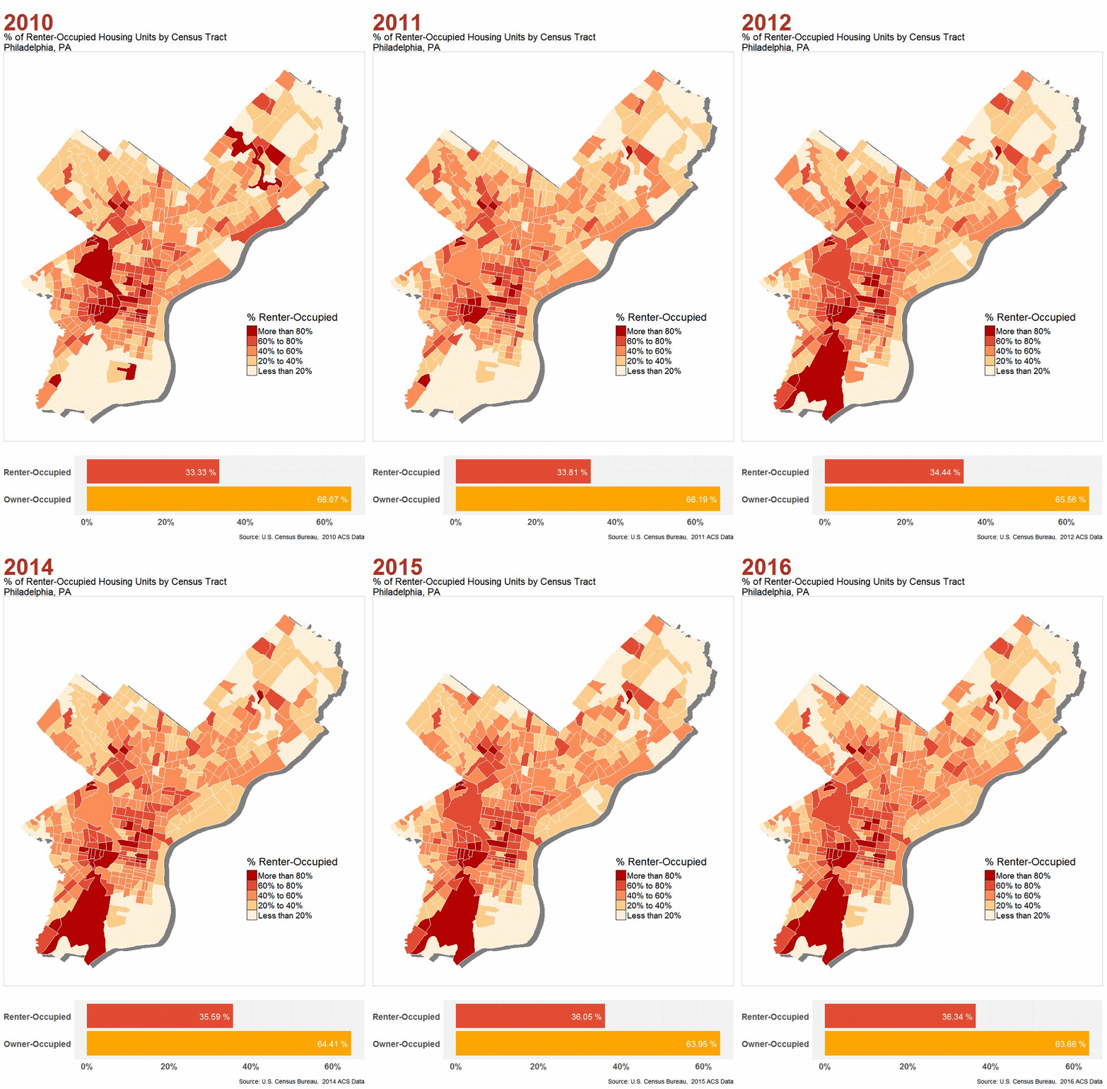
Animated Choropleth Map of Philadelphia Housing Tenure
Does the housing tenure pattern in Philadelphia change significantly from 2010 to 2016 ?

Housing Tenure Pattern Change 2010 - 2016
Philadelphia, PA
Philadelphia, PA
METHOD
1. Data Collection
- Download 7 years of Philadelphia tenure data (2010 - 2016) from Census ACS Data Portal.
- Download 2010 Philadelphia census tract shapefile from Open Data Philly.
2. Data Cleaning & Processing
- In Excel, for every CSV file downloaded, delete empty columns and margins of error values of total, renter-occupied and owner-occupied housing units.
- In R, import cleaned CSV files and:
o Join CSV files with Philadelphia 2010 census tract shapefile
o Calculate percentage of renter-occupied housing units
o Combine 7 data frames into one tall-format data frame
o Turn all NA values to 0
- Additional modification:
o Make sure that the percentage values are represented in percent format (50 instead of 0.5)
o Make sure that there is a “YEAR” column and all year values are in numeric class
- I also want to create bar charts comparing the percentage of owner-occupied and renter-occupied housing units in each year:
o Create data frames with the percentage values I need
3. Data Visualization
- Ready to create maps and charts!
o First determine the layout and style of map and bar chart
o Run a for loop to create 7 maps and 7 charts for each year on one click.
o Plot map and chart for each year on one page
o Finally, create the final animated GIF image!
RESULT
Now we can answer the question we raised before: does the housing tenure pattern in Philadelphia change significantly from 2010 to 2016 ?
From what I see from the final GIF image, there is no significant change in the percentage of renter-occupied housing units. In other words, the housing tenure pattern in Philadelphia from 2010 to 2016 does not change too much. However, the percentage of renter-occupied housing units did keep increasing from 2010 to 2016.